每当我们乘坐中国国际航空公司(下称国航)的飞机,机翼上醒目的凤凰标志总是让人眼前一亮。这个红色的凤凰图案,由联合国教科文组织和平艺术家、清华大学文科资深教授、清华大学美术学院教授韩美林先生于1988年与原国航宣传广告部副经理郑天石先生共同设计。
这个被称为“飞得最高的设计”,图案是怎么设计出来的?它为什么能沿用至今,并被无数旅客深深记住?
这里我们就来说说国航logo背后的故事。
Whenever we board a flight of Air China,the prominent phoenix logo on the wing always catches our attention.This red phoenix pattern was designed in1988by Han Meilin,a senior professor of humanities at Tsinghua University and a professor at the School of Fine Arts of Tsinghua University,in collaboration with Zheng Tianshi,then the deputy manager of the Advertising Department of Air China,and was recognized as the"design that flies the highest"by the United Nations Educational,Scientific and Cultural Organization(UNESCO).
How was this design created and why has it been used till now,deeply imprinted in the minds of countless passengers?Let's take a look at the story behind the logo of Air China.

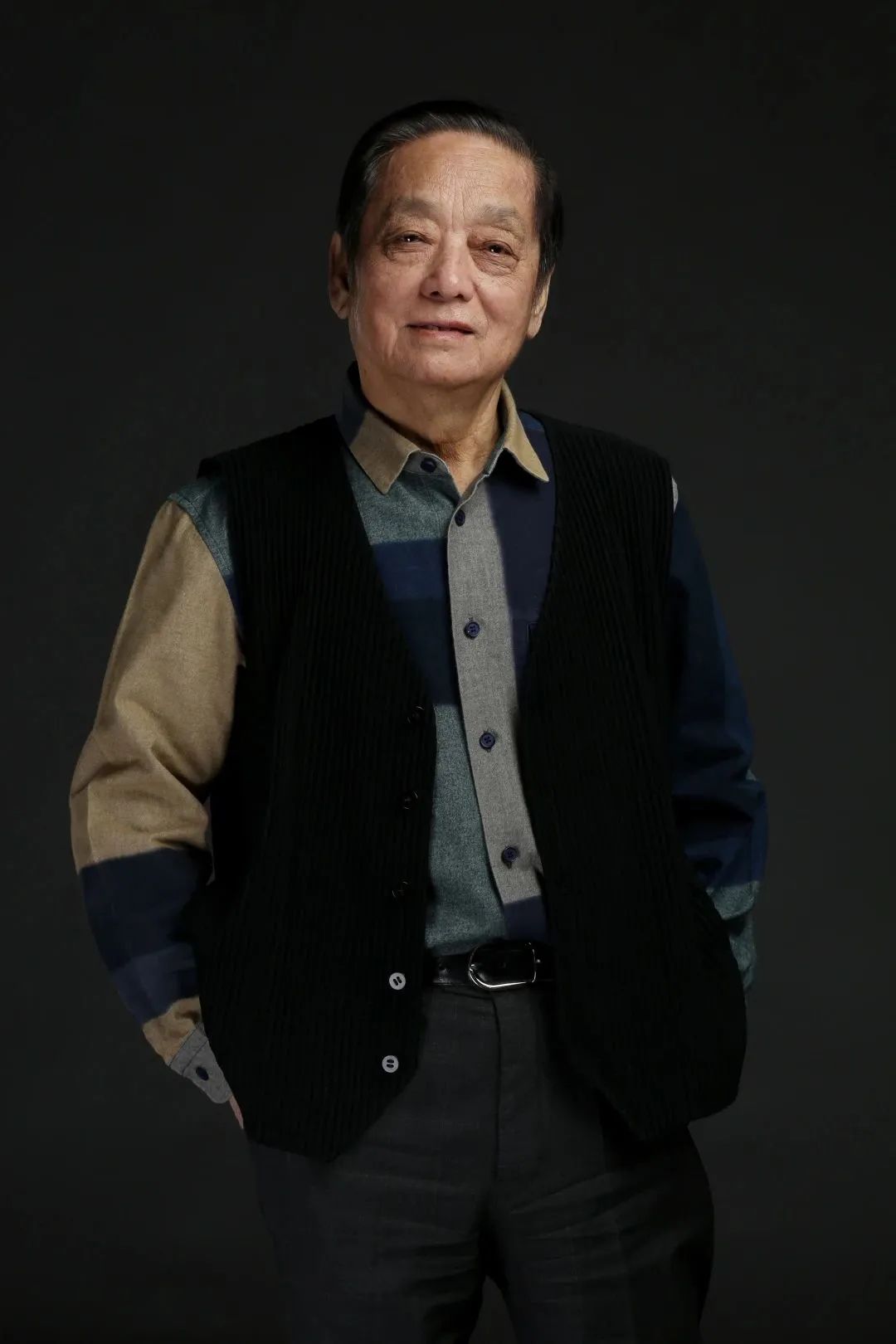
韩美林,1936年生于中国山东济南。1955年考入中央美术学院(1956年随院系调整成为中央工艺美术学院的首届学生)。现为清华大学文科资深教授、中央文史研究馆馆员、中国美术家协会陶瓷艺术委员会名誉主任、世界华人协会副会长、中国工艺美术学会名誉会长。
近年来陆续在杭州、北京、银川创建“韩美林艺术馆”,在宜兴创建“韩美林紫砂艺术馆”,积极推动社会美育和国际文化交流。创建“韩美林艺术基金会”,投身艺术公益和社会慈善。2015年获联合国教科文组织“和平艺术家”称号。2016年“美林的世界韩美林全球巡展”启动,先后于威尼斯、北京、巴黎、列支敦士登、首尔、曼谷等地举办个展,被威尼斯大学授予“荣誉院士”称号。2018年荣获国际奥委会“顾拜旦”奖章、“韩国文化勋章”。2019年,荣获“影响世界华人大奖终身成就奖”。
灵感:有凤来仪
Inspiration:Phoenix
韩美林先生在接到国航的设计请求时,第一个想到了凤凰,“我们中国传统的鸟”。
飞机的外形本就近似于鸟类,而凤凰不仅是百鸟之王,更是德、义、礼、仁、信等美好品质的象征。《山海经》中描述凤凰时道:“五采而文……载歌载舞,见则天下宁。”它常常成为中国这个东方大国悠久历史和文明气质的表征,同时还拥有翱翔四海的能力,撷英咀华,志存高远。因此,以凤凰为国航的代表性标志,十分贴切而深远。
凤凰的形象千姿百态,用哪个更好?韩美林先生去云南考察时,看到了云南晋宁石寨山出土的西汉中期的青铜凤形拐杖头,立刻就被吸引了。其实杖首本身的模样更接近孔雀,不过凤凰作为神话中虚构的鸟类,本就取自孔雀的形象,因此倒也不拘谁是鼻祖、谁是源头。
这个西汉中期的青铜凤形拐杖头给了韩美林先生创作的灵感。“我从云南离开,上飞机就开始构思,下飞机就完成了主要图案。这个图案当时感觉就很好。”但即便是一开始顺利的创作,也经历了七十多次修改才最终定稿。
Han Meilin was born in Jinan,Shandong,China in1936.He enrolled in the Central Academy of Fine Arts in1955(which was renamed the first batch of students of the Central Academy of Arts and Crafts in1956due to departmental adjustments).He is currently a senior professor of humanities at Tsinghua University,a curator at the Central Research Institute of Culture and History,an honorary chairman of the Ceramic Art Committee of the China Artists Association,a vice president of the World Chinese Association,and an honorary chairman of the China Arts and Crafts Association.
In recent years,he has established the"Han Meilin Art Museum"in Hangzhou,Beijing,and Yinchuan,the"Han Meilin Zisha Art Museum"in Yixing,and has actively promoted social aesthetics and international cultural exchanges.He created the"Han Meilin Art Foundation"and devoted himself to art public welfare and social charities.In2015,he was awarded the title of"Peace Artist"by UNESCO.In2016,the"Han Meilin Global Tour Exhibition"was launched,and solo exhibitions were held in Venice,Beijing,Paris,Liechtenstein,Seoul,Bangkok and other places.He was awarded the title of"Honorary Academician"by the University of Venice.In2018,he won the International Olympic Committee's"Pierre de Coubertin"Medal and the"Order of Cultural Merit"from the Republic of Korea.In2019,he won the"Lifetime Achievement Award"of the"Influential Chinese Awards".
When Han Meilin received the design request from Air China,the first thing he thought of was the phoenix,"the traditional bird of China".
The shape of an airplane is similar to that of a bird,and the phoenix is not only the king of birds,but also a symbol of virtues such as righteousness,propriety,kindness,trustworthiness,and benevolence.In the"Classic of Mountains and Seas",the phoenix is described as"variously colored and decorated...singing and dancing,and appearing to bring peace to the world."It often represents the ancient history and cultural temperament of China,and also has the ability to soar the seas and gather the essence of the world.Therefore,the phoenix is a fitting and profound representative symbol for Air China.
The phoenix has various forms,so which one to use?When Han Meilin was conducting research in Yunnan,he saw a bronze phoenix cane head from the mid-Western Han Dynasty unearthed from the Shizhaishan Mountain in Jinning,Yunnan,which immediately attracted him.In fact,the shape of the cane head itself is more like a peacock,but the phoenix,as a mythical bird in Chinese culture,was originally derived from the image of a peacock.Therefore,it is not important to distinguish who is the ancestor or source.
This bronze phoenix cane head from the mid-Western Han Dynasty gave Han Meilin inspiration for his creation."After leaving Yunnan,I started to conceive the design on the plane and completed the main pattern after getting off the plane.I felt that the design was good at that time."However,even with a smooth start to the creation process,the design went through more than70revisions before it was finalized.
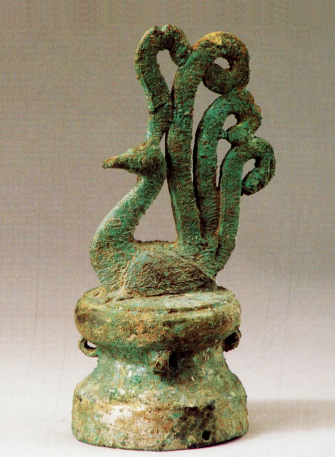
▲青铜凤形拐杖头Bronze Phoenix-Shaped Cane Head
最终确定的凤凰形象通体采用中国红,代表着喜庆、热闹与祥和。中国汉代最早的祭祀服饰便为红色,用于对日神表达虔诚,因此红色也有光明、正统之意。从盛世气派的唐宋遗风到独领风骚的明清神韵,再到新中国国旗上的一抹正色,红色始终象征着我们这个泱泱大国的精神气质。
设计:大道至简
Design:Simplicity is the ultimate sophistication.
国航官方对这个logo的描述为“中国红、凤凰体、VIP”——标志除了以远古传说中的祥瑞之鸟凤凰为图案外,还采用了中国传统的大红色,同时还是英文“VIP”(尊贵客人)的艺术变形。
尽管寓意深厚,它的设计却又十分简洁。“它一共四笔,一个是头上这一小点,另外三笔也是顺着下来的。”韩美林先生解释道。这四笔环环相扣又层次分明,使一只凤凰跃然纸上。“这是人们在过路的一瞬间看的东西,你必须抓住人家。所以你画得太细了不行,很复杂的人家也不看。”因此,需要化繁为简、以小见大的抽象能力。
The final phoenix image used for the logo was entirely in China red,representing happiness,liveliness,and peace.Red was the earliest color used in Han Dynasty sacrificial attire to show piety towards the sun god,and therefore,it also has a connotation of brightness and orthodoxy.From the grandeur of the Tang and Song dynasties to the unique charm of the Ming and Qing dynasties,and to the touch of authenticity on the new Chinese national flag,red has always symbolized the spiritual temperament of our great country.
As for the design,the official description of the logo by Air China is"Chinese red,phoenix body,VIP."In addition to featuring the auspicious bird,the phoenix,from ancient legends,the logo also used traditional Chinese bright red and transformed the English abbreviation"VIP"(Very Important Person)into an artistic form.
Despite its profound symbolism,the logo's design is very simple."It consists of only four strokes,one small dot at the top and three strokes that follow,"explained Mr.Han Meilin.These four strokes are interlocked and have distinct layers,creating the impression of a phoenix leaping off the page."This is something people see in passing,so you must capture their attention.If you draw it too finely,people won't look at it if it's too complicated."Thus,it requires the abstract ability to simplify and see the bigger picture.
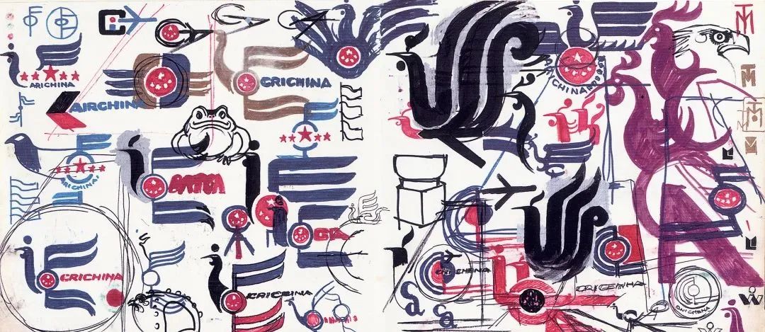
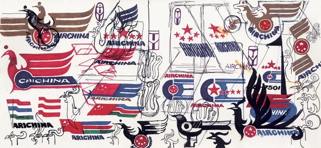
▲韩美林先生的国航标志设计手稿The design sketch of Mr.Han Meilin's logo for Air China
但具体“好”在什么地方、“抽象”又是如何进行的,就如其他一切经典艺术的创作一般,是无法用语言清晰阐释的。韩美林先生笑称:“当时处于一种驾云的状态,是没有理性的。”
在设计时,韩美林先生并未刻意想着“VIP”的形状,不过定稿后的图案恰好与这三个字母相吻合,也为logo进一步增添了意蕴。
However,the specific reasons why it is considered"good"and how the abstraction was achieved are similar to the creation of all classic art and cannot be clearly explained in language.Mr.Han Meilin joked,"At that time,I was in a state of driving on clouds,without reason."
During the design process,Mr.Han Meilin did not intentionally think of the shape of"VIP,"but the final design happened to coincide with these three letters,adding further meaning to the logo.
延续:国风传承
Continuation:Inheriting National Style
韩美林先生虽以画作而闻名,但他年轻时在中央美院学的是设计类专业。他在大学二年级时参与设计了天安门游行队伍,三年级时参与设计了人民大会堂的灯具,此后还曾给《北京日报》做美编,从插图、装饰画到专栏画稿,他的思维和格局逐步打开。除此之外,他也在雕塑、陶瓷、油画等领域博采众长,对于艺术的学习和欣赏并不局限于某一家,其作品也相应地充满活力和新意,所谓“流水不腐,户枢不蠹”,大抵如此。
Although Han Meilin is known for his paintings,he studied design at the Central Academy of Fine Arts when he was young.In his second year of university,he participated in the design of the Tiananmen Square parade,and in his third year,he participated in the design of the lighting for the Great Hall of the People.He also worked as a graphic designer for the Beijing Daily,creating illustrations,decorative paintings,and column illustrations,which helped to expand his thinking and horizons.In addition,he also learned from various fields such as sculpture,ceramics,and oil painting,and his works are full of vitality and innovation,without being limited to a particular style or tradition.
而国航logo的独到之处在于,将多年积累的功底化于几笔之中,并在百家之长中找到个人风格与中国特色的交汇点。清华大学美术学院教授陈楠认为,韩美林先生的作品虽各不相同、不断突破,但每一件作品都蕴含着对传统文化的延续。“在任何时候,我都坚持传统与现代的结合。”韩美林先生在会见意大利设计师门迪尼时曾这么阐述自己的创作理念。
The uniqueness of the China Airlines logo lies in the fact that Han Meilin's years of experience and skills are condensed into a few strokes,finding a convergence point between his personal style and Chinese characteristics.According to Chen Nan,a professor at the School of Fine Arts of Tsinghua University,although each of Han Meilin's works is different and constantly breaking through boundaries,every piece embodies a continuation of traditional culture."At all times,I insist on the combination of tradition and modernity,"Han Meilin explained his creative philosophy to Italian designer Giorgio Mondini during a meeting.
1988年,国航启用凤凰图案作为航徽,使之成为中国民航发展道路上一个不可磨灭的印记。二十五年后,韩美林先生又再度为国航设计了以祥云、瑞凤、陶土三大类元素为主体的国航新航空内饰图形元素,将传统装饰艺术与现代纺织技术相结合。
In1988,Air China adopted the phoenix pattern as its logo,leaving an indelible mark on the development of China's civil aviation.Twenty-five years later,Mr.Han Meilin once again designed a new set of Air China's aviation interior graphic elements based on the three main elements of auspicious clouds,auspicious phoenix,and pottery,combining traditional decorative art with modern textile technology.
彼时,韩美林先生经过四十天的梳理和归集,提出了这套“陶、云、凤”的概念组合,并具体化为二十多套设计作品。“陶”的灵感来源于新石器时代的水纹黑陶片和拓印陶纹,以陶泥叹誉大地的深沉;“云”的创意来自明锦,以祥云求问天的存在,拉近人与天的距离;“凤”的灵感则来源于汉代瓦当、砖凤纹和唐三彩,并贯彻了航徽上吉祥与福瑞的寓意。旅人们“乘凤来去”,国航也带着中华本土的优秀文化飞向世界各地。
At that time,after forty days of sorting and collating,Han Meilin proposed the concept combination of"pottery,cloud,and phoenix"and concretized it into more than twenty sets of design works.The inspiration for"pottery"came from the water ripple black pottery and rubbing pottery patterns of the Neolithic Age,praising the profoundness of the earth;the idea of"cloud"came from Ming brocade,seeking the existence of auspicious clouds in the sky,and bringing people closer to the sky;the inspiration for"phoenix"came from Han Dynasty tile and brick phoenix patterns and Tang Sancai pottery,embodying the auspicious and blessing meanings of the airline's logo.Travelers"ride on the phoenix to come and go,"and Air China also carries excellent Chinese culture to fly to various parts of the world.
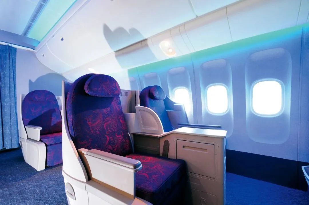
▲韩美林先生设计的国航内饰 Mr.Han Meilin designed the interior decoration of Air China.
韩美林先生希望“即便一个从未来过中国的外国人,一进国航机舱便感觉到已经来到中国”。在国航的凤凰标志以及内饰设计中,我们不仅可以看到这一愿景的实现方式,更能感受到韩美林先生一以贯之的艺术追求,这恰恰印证了联合国教科文组织在为其颁发“和平艺术家”奖项时的评价:“韩美林为世界的多姿多彩做出了贡献。”
Mr.Han Meilin hoped that"even a foreigner who has never been to China would feel like they have arrived in China the moment they step into a China Airlines cabin."In the China Airlines Phoenix logo and interior design,we can not only see how this vision was realized,but also feel Mr.Han Meilin's consistent artistic pursuit,which precisely confirms the evaluation of the United Nations Educational,Scientific and Cultural Organization when awarding him the title of"Peace Artist":"Han Meilin has made contributions to the diversity of the world."
来源:人文清华讲坛作者陶天野
编辑:韩玥
Source:Humanities Tsinghua Lecture by Tao Tianye
Editor:Han Yue